The IPO Is Where the Hitchhiker Gets Out
There's an old line in venture I'm going to butcher, but it goes something like this.
A founder is driving cross-country and running low on gas. They pull over for a hitchhiker who promises to chip in for fuel. Grateful, the founder waves him in. A few miles down the road the hitchhiker pulls a gun, rests it on his knee, and says: "I'll pay for the gas. But we're going where I want to go."
That's the VC. And where the VC wants to go is the IPO.
I don't say that as an insult, I love venture, the incentive is completely rational. Venture is a power-law business. Most of the portfolio returns nothing, a handful returns the fund, and the way you turn a paper markup into an actual distribution your LPs can spend is a liquidity event. M&A counts. But the fund-returners, the ones that make the whole model work, those are the ones that ring the bell. So yes, once we're in the car, we are, gently and with a smile, steering toward the exit.
Here's the part nobody in that car says out loud: the IPO is our finish line. For the person buying at the initial offering, it's the starting line. And the data on what happens after the starting gun is genuinely grim.
The pop is a magic trick
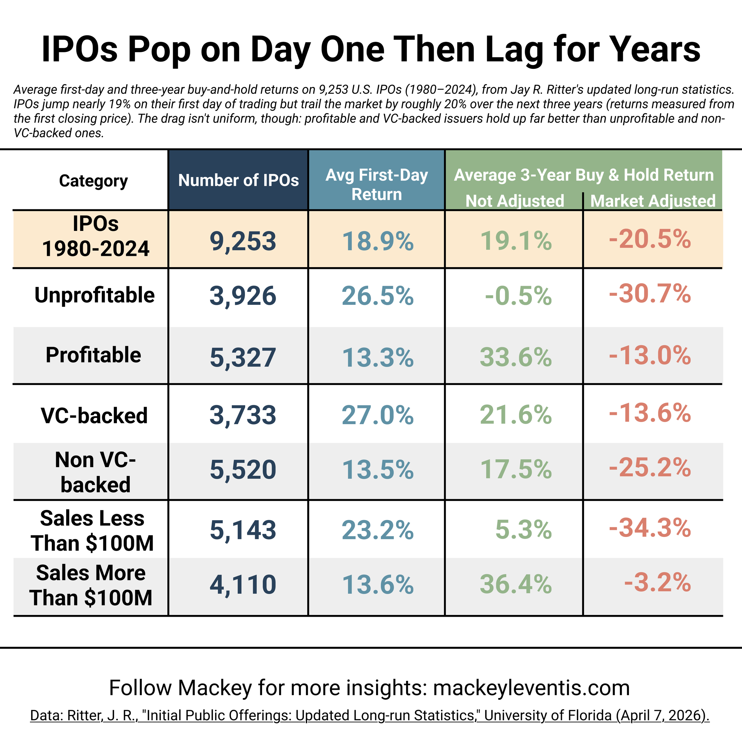
Start with the number everyone quotes. Across 9,253 U.S. IPOs from 1980 to 2024, the average first-day return was +18.9%. Stocks pop. That part's real.
But look closely at who catches it. That pop is measured from the offer price to the first day's close — and if you're reading about the IPO on your phone, you are not getting the offer price. The allocated shares went to institutions and insiders before the thing ever traded. By the time you can click buy, the pop has already happened to somebody else. Ritter, sensibly, measures long-run returns from the first closing price — the price a normal person could actually pay. That's the honest starting point, and it's where the story turns.
Then it lags for years
From that first close, the average three-year buy-and-hold return across the whole dataset is +19.1%. Sounds fine. Positive, even. You could stop reading and feel okay.
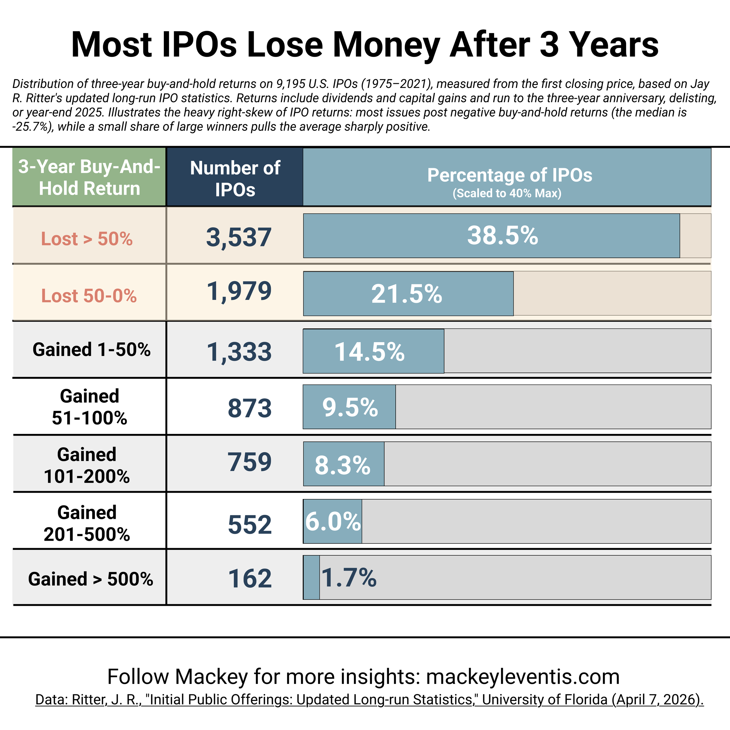
Don't stop reading. Benchmark it against the market over the same window and that +19.1% becomes −20.5%. The average IPO trails the market by roughly twenty points over three years. And the average is the flattering number, because it's dragged upward by a few monsters. The median IPO is down −25.7% at three years.
Sit with the gap between −20.5% average and −25.7% median for a second, because that gap is the whole story. When the median is well below the mean, you're looking at a distribution carried by a tiny sliver of winners. Which is exactly what the buckets show:
60% of IPOs are underwater three years later. Not "underperforming" — underwater. Down money. (38.5% lost more than half their value; another 21.5% lost something between nothing and half.)
1.7% — 162 companies out of 9,195 — gained more than 500%.
That's it. That's the shape. A vast field of losers and a handful of rockets, and the rockets do all the work in the average.
If that shape looks familiar, it should. It's the exact same distribution as a VC portfolio. Which is the quiet irony at the center of all this: the public-market IPO buyer inherits venture-style dispersion — most bets underwater, returns concentrated in a few names — but without the venture-style access, diligence, board seat, or entry price. You get the risk profile of an early-stage fund and the informational position of a retail tourist.
"VC-backed" helps. It doesn't save you.
You'd expect the companies that came up through the venture machine to hold up better, and they do. VC-backed IPOs post a three-year market-adjusted return of −13.6%, versus −25.2% for non-VC-backed. So the machine adds something.
But read that carefully. "Better" here still means losing to the index by thirteen points. The best-pedigreed cohort in the dataset is still a bad trade for the person buying at the open. The venture stamp improves your odds of picking a survivor; it does not flip the base rate to positive.
And the base rate gets uglier the further you get from quality. Unprofitable companies at IPO: −30.7% market-adjusted. Companies with under $100M in sales: −34.3%. The worst outcomes cluster exactly where the hype clusters — young, unprofitable, small, story-driven. The names that trend are disproportionately the names in the losing buckets.
Who's driving now
So here's where I land. An IPO is not the moment a company crosses the finish line. It's the moment the earliest, best-informed, most access-advantaged investors in the entire capital stack look at the company, look at the market, and decide now is a good time to sell.
To you.
The hitchhiker got where he was going. He's paid for his share of the gas (mostly), he's opening the door at the exit he chose, and he's handing you the keys with a friendly nod.
Which is fine. Somebody has to drive the next leg. Just remember, when the whole feed is cheering the listing, that the person most thrilled to sell you the ticket is the one who's been in the car since the beginning — and knows exactly where the road goes from here.
